Everybody has a cell phone or a mobile device. If they don’t, they wish they did. The internet is always just a few mere swipes and pokes away at all times anymore. It is becoming increasingly important that our clients’ websites function just as well inside your mobile device as it does in your desktop browsers.
Responsive web design (RWD) is a web design approach aimed at crafting sites to provide an optimal viewing experience—easy reading and navigation with a minimum of resizing, panning, and scrolling—across a wide range of devices (from mobile phones to desktop computer monitors). – Source: Wikipedia at http://en.wikipedia.org/wiki/Responsive_web_design
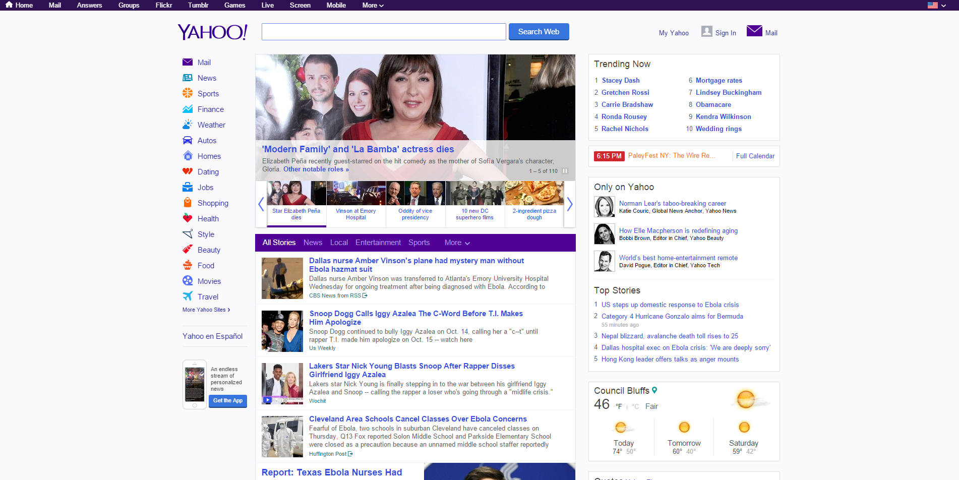 It’s important that we have the ability to test the designs and functions we implement across a wide assortment of devices and we have numerous tools to assist us in this daily task. From desktop widescreens, square monitors (yes, people still use these), handhelds, tablets, and cellphones: we strive to perfect how the site responds in all of these environments. In this image view Yahoo’s website is in full screen on my desktop.
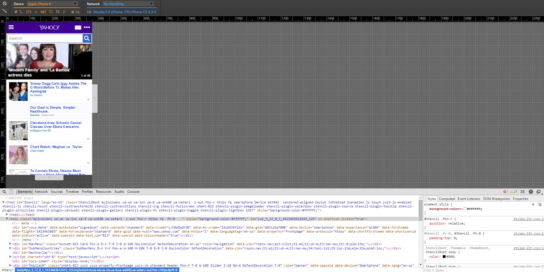 Here you can see a view we get to see what iPhone 6 users see, even though we might not own one.
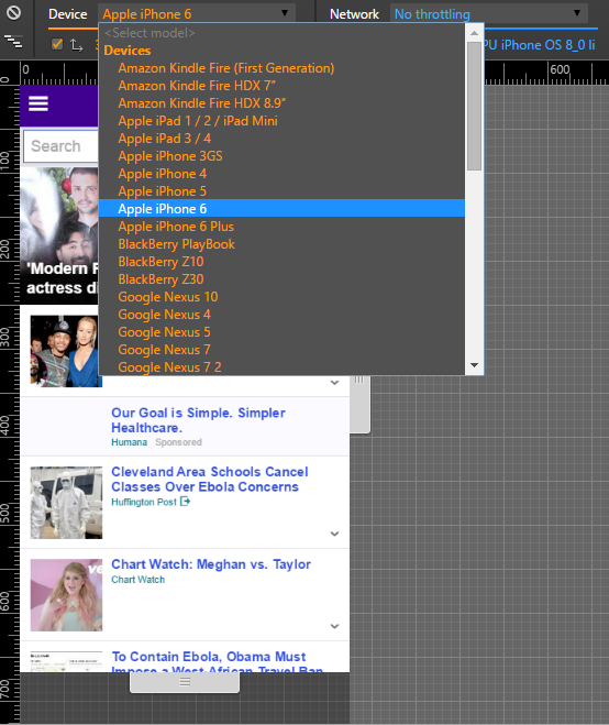 As you can see, we have the ability to emulate most devices which helps us to give you what you deserve. In short, we take what could have been an immensely complicated task and we simplify it for you. That saves us time, and that means it saves you money.
Follow Us!